Sarah Laser
Center & Medspa

Title: Sarah Laser Center & Medspa Rebrand
Category: Branding, Web Design
Live Site: sarahlasercenter.com
After consulting with the owner of this small business about their branding needs I found that they were looking for a cleaner look, but to still stand out from other Medical Spas. Their current branding was inconsistent and outdated, and their website was not responsive.
#eeeeff
#7f7caf
#041b15
#51a3a3
#ef959d
#dd7373
After speaking with the client and looking at the medspa's current branding, I found that they didn't have much in the way of consistent branding to start with. They wanted to have a sophisticated and fun look. I chose a few bright colors paired with contrasting nuetral colors to achieve this.
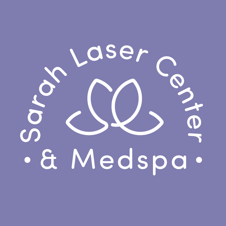
Below you will see the client's old logos followed by my different ideas, then the final logo lockups I created. My final logo involves the companies initials "SL" manipulated and combined to create the image of a lotus flower. I decided to make this form and the text rounded to have an approachable and fun atmosphere.




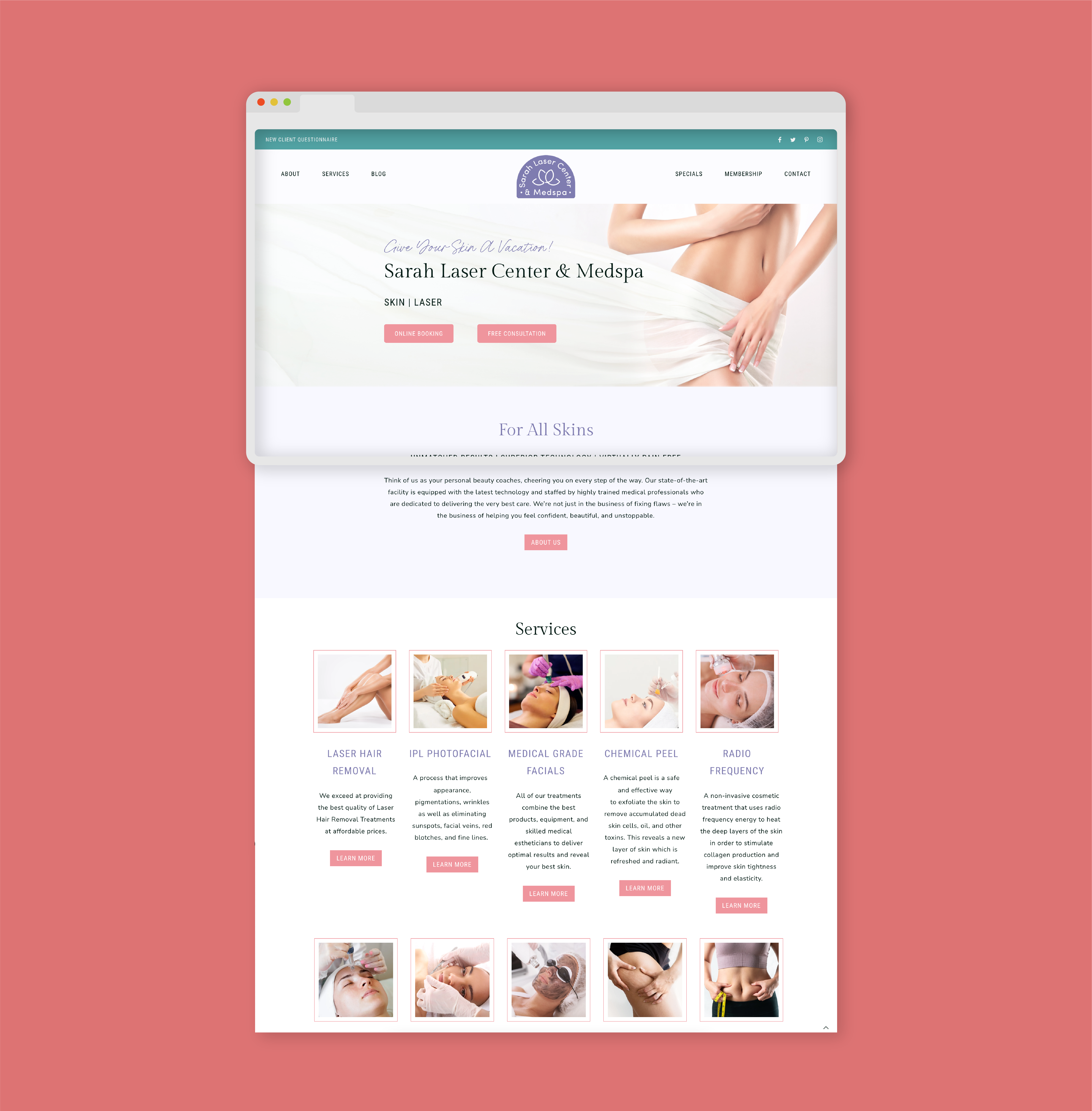
Significantly updated website to modernize it, made it responisve and chose photos that were consistent with the branding. There were a total of 15 pages to redesign and 11 blog posts. This was my first project in wordpress so it was a great opportunity to learn how to use the platform, I also used my knowledge of HTML/CSS to change some of the code to get everything just how I wanted it to look.
