East Falls
Farmers Market

Title: East Falls Farmers Market Rebranding Concept
Art Director: Rodd Whitney
Category: Branding
The prompt for this class was to rebrand a local business, I chose the East Falls Farmers Market. Through research I found that they didn't have much branding except for a logo, and that their main goal is to bring the community of East Falls together through locally sourced produce and events. I really resonated with this mission and strived to rebrand the market in a way that reflects it and represents the weaving together of communities. I accomplished this through intertwined bright colors, bold fonts, and imagery made of different colors.
#f0568b
#f5ec44
#35bdb4
#5ec9e3
#a663a8
#393a66
After researching the farmers market I found that it is a community and cultural hub for the East Falls area, but currently they lack a cohesive brand. Their website and social media focus almost entirely on visiting vendors. Which is useful information for customers but doesn't say much about the market itself, or its values.
I researched other farmers markets in the Philadelphia area as well, such as the Weavers Way Co-Op and The Food trust, and found that their brand involved similar orange, green, and brown colors. I wanted to step away from these colors for the rebranding, so I chose a variety of bright colors.
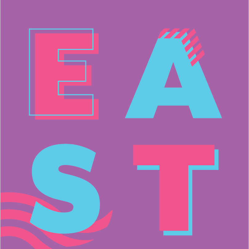
I wanted the logo to involve the bright colors and have a woven, patchwork feel to represent communities coming together. An iconic feature of the East Falls area are the nearby intersecting bridges. I created a logo made up of different bright colored shapes to create an abstract depiction of these images. The logo sets up the bright colors and the patchwork imagery for the rest of the brand. I explored many iterations before the final logo, the first logo below is the market's original logo.

Part of the East Falls Farmers Market's mission is to be sustainable, so deliverables include reusable bottles and tote bags for visitors to use while they are shopping at the market. There is also a promotional brochure that would be given out to spread the word about the market. In addition the brand includes bus stop posters for advertising events to the surrounding area.
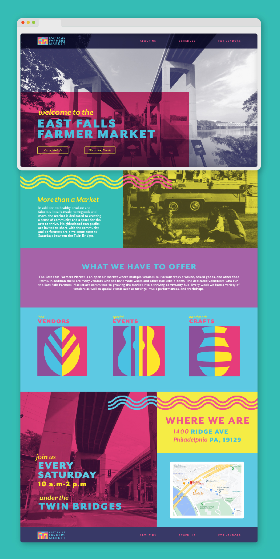
All deliverables use the brand's bright colors and bold typefaces, as well as the patterns and icons designed to convey the feeling of a community woven together. I created a series of three graphics in the same geometric patchwork style as the logo to categorize the different aspects of the market. The leaf graphic represents food vendors, the vase graphic represents craft vendors, and the guitar graphic represents musical performances and other events.


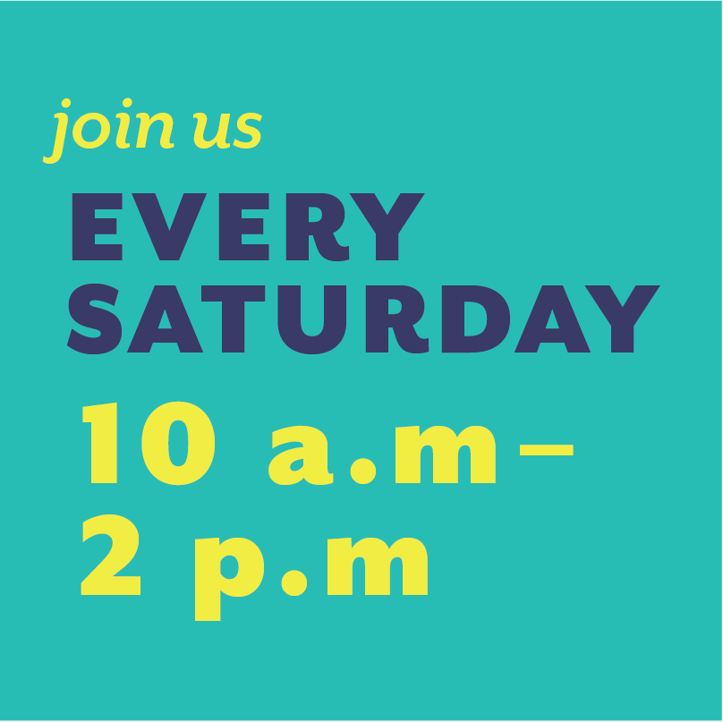

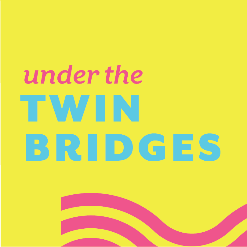


The new website had to match up with my new branding while retaining the necessary information. Some of this information includes the schedule for what vendors and events will be present at the market each week. As well as general information and information for prospective vendors.
The instagram posts I designed promote upcoming events and vendors, as well as general posts with quotes or pictures relating to the market.

The brand book shows the entirety of the brand as well as information about what I percieved as the problems with the original branding and details about my design decisions. In addition it details the process of creating this brand such as the different logos I designed before the final logo and sources of inspiration.
In addition this books shows all of the deliverables and the web/social media presence. Below you can flip through each page and read more about the brand!


